CREATE NEW FORUM POST
┌───────────────────────────────────────────────────────────────────────────────────────────────┐ │ Forum title... │ └───────────────────────────────────────────────────────────────────────────────────────────────┘ ┌───────────────────────────────────────────────────────────────────────────────────────────────┐ │ Share thoughts... │ └───────────────────────────────────────────────────────────────────────────────────────────────┘ ┌────────────────┐ ┌────────────┐ │ + Add Media │ │ ► PUBLISH │ └────────────────┘ └────────────┘
OVERVIEW
The internet was originally built for connection, and growing up on it felt like entering a rainbow wild west to freely self-express, explore, create, and form genuine connections. Using it now means entering an enshittified wasteland filled with extractive algorithms that prioritise profitable optimisation over individuality. This shift has contributed to growing anxieties about where technology is taking us. Digital optimism is the choice to persevere and hope in spite of those fears.
My research asks: How might a design practice rooted in Buddhist values offer a more optimistic digital world?
Whilst nostalgia may comfort in times of uncertainty, it isn’t a sustainable path forward. Instead, mindfulness and impermanence (accepting change) can provide the framework for a more intentional (and fun) way to engage with technology. This isn’t a prescription for others to adopt Buddhism, but that intentionality is the antidote to despair.
The experiments and contextual anchors in this portfolio trace that idea through making. Referencing the Tibetan sand mandala, Summer Wars (2009), and my knit machine induction, a recurring pattern kept emerging: the most meaningful moments happened when I stopped optimising for an outcome and just made with intention. When work is made that way and shared genuinely, it contributes something human to the digital world. Enough of those contributions, made by enough people working this way, is what a more optimistic internet is actually made of.
ABOUT THIS SITE
This portfolio is itself an attempt to practice what it preaches.
The website was vibe coded using Claude (Anthropic, 2025), and is designed to look like you've stumbled upon an old internet forum. This is because I genuinely believe forums (like Reddit) were, and still are, real pockets of the internet where connection and communication are happening authentically. They were where I had the most fun growing up, where I expressed myself through customisation and BBCode, and where I connected with internet friends. Pre-Discord, I grinded tf outta Mineplex forums. The navigation bar mimics early search directories as a nod to that same era.
The design is intentionally simple: one page, one colour, clean sections. Beyond accessibility and time constraint reasons, it reflects the honest simplicity of early web design. Besides the lone hot pink, the interactive, scrolling rainbow background represents self-expression and my depiction of an optimistic digital future.
The included ASCII art and emoticons are personal. I used both constantly during the period of my life when I was happiest on the internet, making things just for the joy of it. Including them here felt right.
The audio was originally meant to be a Buddhist Mantra of Avalokiteshvara (AusomChance, 2017) with gongs my mum always has on repeat, but the singing felt too distracting for a reading-based website. Instead, I used an edited version of Tibetan singing bowls (Mindful Melodies, 2023) (weirdly enough, it was so hard to find good audio of gongs).
I’ve added a guestbook at the end of this page to add a sense of community and connection :) I was inspired by many neocities.com sites that do the same. It’s a simple, fun touch.
Anthropic. (2025). Claude 4 Sonnet [Large language model]. https://claude.ai/
AusomChance. (2017, January 23). Mantra of Avalokiteshvara (A quick 10 mins Power Chant) - with Lyrics [Video]. Youtube.
https://www.youtube.com/watch?v=rmFJQPovdu0
Mindful Melodies. (2023, October 19). Healing Frequencies of Tibetan Bowls [Video]. Youtube. https://www.youtube.com/watch?v=b1iq8y9Tvd4
#######
# #
# #
## ##
## ##
## #
# ##
## #
# ########### #
# ## ## #
# # # #
#### # # ####
# # ##### ##### # #
# # ## ## # #
# ## # #
# ## # # # # # #
# # ##### ##### # #
# # # #
# ## # #
# # ## #
# ## ### #
# # ## # # #
# # # ## ## # # #
## # #### # ##
# #
######## #######
#### ## ## ## ####
## ####### # ##
## ### ##
# ## ### # # #
# ########### # # #
# ## # #
# ## # # #
# ## # # #
# ### # # #
# ############ # # # #
# ## # # #
# ## # # #
# ## # # #
# ### # # #
# ##### # ##### #
# ####### #
# #
# ##### #### #
# #### ############ #### #
# # ####### ## #
## # ## # ##
# ######################################## #
# #### #### #
# # ############ ############# # #
# # # # # #
# # ### ########## ## #
# #### ############## # #### #
# #### # ####### #
# # # ##### #
# # ## #
# ### #
# # #
## ### ##
#### ###### ####### ####
####################### #######################
#breathe in#breathe out
✽ COLLECT & CATALOGUE

Intention:
To collect a range of media that relates to my developing research topic, and catalogue them in a creative way.
Hypothesis:
I totally expect the collection to be colourful and rainbow (who would have guessed…)
Context:
This exercise reminded me of the 100 image visual essay during a first year subject, Design Theory: Critical Approaches to Visual Culture. This differs from that because we start with a loose intention, and see where it takes us. I’m completing this after recently reading the design book, Japanese Color Matching (SendPoints, 2022).
Method:
- Collect images/links/quotes related to my ‘Identify Interests’ mindmap from my saved bookmarks (ie. Pinterest pins, Youtube playlists, Instagram saved)
- Review collection to find an underlying theme
- Refine collection to suit found theme
- Vibe code a website using AI and host it on Neocities (note: I recycled assets from an old project to save time)
- Make an animated demo of the website as a gif
Reflection:
I surprised myself by building an interactive website instead of a static poster, and totally thought it’d take me forever… but I finished it in around 2 hours with help from AI. Starting without a theme was frustrating, but collecting images I genuinely loved naturally led to one, and refining led to me discovering new awesome references like Summer Wars (Hosoda, 2009), a movie I now really want to watch since it explores a digital “utopia.” Coding was satisfying as always and I'm really happy with the outcome. To improve it, I'd make the Windows 7 overlay functional, source higher quality images, and potentially explore a digital gallery format inspired by entranceorexit.net (Selwa, 2020).
Hosoda, M. (Director). (2009). Summer Wars [Film]. Warner Bros. Pictures.
Selwa, M. (2020). Entrance or Ǝxit [Web Project]. entranceorexit.net. https://entranceorexit.net
SendPoints Publishing Co., Ltd. (2022). Japanese Color Matching [Book]. SendPoints.
⚓︎ SUMMER WARS
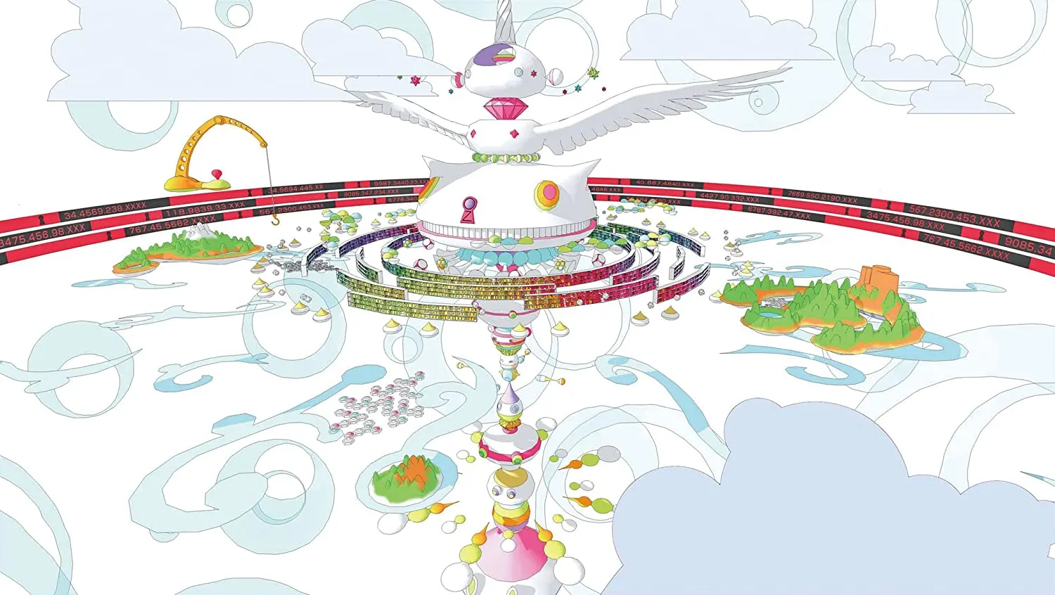
Summer Wars (2009) is an animated film directed by Mamoru Hosoda, a renowned storyteller best known for One Piece, Digimon, and award-winning Wolf Children, released through Warner Bros. Pictures. The film's visual world of Oz was conceptualised by Takashi Murakami (Hosoda, 2013), a globally recognised contemporary artist who pioneered the Superflat movement.
Oz is a near-perfect digital utopia fully integrated into everyday life; an extension of the self built primarily for connection and free of paywalls (almost sounds like our internet…). What disrupts it is a single AI named Love Machine, which hacks Oz and bleeds into the physical world, growing powerful enough to threaten real-world infrastructure including nuclear systems. The war is won through collective belief: millions of strangers offering their avatars under one shared wish to protect family and humanity, something Love Machine cannot replicate.
Easily one of my favourite films I've ever watched, and funnily enough, I even watched it online with others :) What drew me in was a screencap from my Collect & Catalogue experiment (it’s rainbow, cute... what more could you want !!). It's remarkable how ahead of its time it is: AI disrupting a digital utopia, defeated only when people come together and believe (in my case, a user-generated internet). As someone who grew up on the internet and still believes that utopia can exist, I feel deeply attached to it. This film echoes my conceptual research directly, and pushed me to consider how Oz's visual language (colourful, cartoon, simple yet expressive) could inform how I represent an optimistic digital future in my own work.
Hosoda, M. (Director). (2009). Summer Wars [Film]. Warner Bros. Pictures.
Hosoda, M. (2013). Summer Wars: Material Book [Art book]. UDON Entertainment.
|\__/,| (`\
_.|o o |_ ) )
-(((---(((--------
✽ TYPOGRAPHY WORKSHOP


Intention:
To learn the basics of typography and how to make a typeface by Olivia King. I wanted to answer: “How could I represent an optimistic digital future with a font?”
Hypothesis:
I assume that making a grid-based font is simple and approachable, as components can be easily crafted and recycled for other letters.
Context:
My concept was inspired by my previous two contextual anchors about how I might design an optimistic POV of the internet, and how I might work within a binary system whilst challenging its boundaries. I wanted to create a grid-based font inspired by early computer monotype, ASCII art, and the internet’s original intention to connect with others, whilst remaining modern, fun and accessible, utilising sharp and curved corners. I wondered if the current internet has lost its personality because it’s accessible-maxxing.
Method:
- Build a moodboard
- Create a template on Illustrator with an overshoot
- Start drafting your typeface only in uppercase, starting with ‘HOD’
- Consider repetition and rhythm of typeface, using modular components to craft letters, ensuring visual harmony
Reflection:
I expected to complete the uppercase alphabet successfully following Olivia's straightforward method, but didn't anticipate how easy it'd be to create extra characters with use for ASCII art in mind. The grid-based system made the process really satisfying as it was modular and intuitive, though 'S' and 'Q' took some iteration to get right (I got so frustrated dude). This experiment affirmed that I can apply my interests into any medium, which has me curious about where my limit actually is; what will stop me? I want to test the typeface by making ASCII art with it, and potentially creating its lowercase counterpart (where the overshoot would be useful) and extra characters often used in ASCII art.
✽ ASCII ART

Intention:
To make the typeface I designed into a functional font, and then make ASCII art with it.
Hypothesis:
I predict I’ll struggle to make my typeface into a usable font on a Windows laptop, and if it fails, I’ll just manually copy and paste which will be too nit-picky. But funnily, I love doing nit-picky, technical things... so I might love the frustrating process.
Context:
In Week 3, I made a custom typeface in Olivia King’s typography masterclass with my prompt being “How could I represent an optimistic digital future with a font?”. I want to use ASCII art to push boundaries of grid-based design.
Method:
- Complete typeface with lowercase, uppercase, and some extra characters
- Turn typeface into a functional font by importing letters into FontForge
- Make ASCII art with the custom font
Reflection:
Making a functional font was easier than expected, though FontForge took some troubleshooting to get the hang of. The biggest surprises were needing to design space as a character, and realising the completed lowercase set wasn't truly monospace… which is something I'd want to fix so it could actually be used for ASCII. I also need to add the extra glyphs, since most ASCII art relies on them rather than the alphabet, which became obvious when I tried to recreate an ASCII piece of my persona made entirely of glyphs. In the meantime, I made a simple emoji with capitals that reads "DO YOU FEEL HAPPY OR NOT. IT IS OK IF U R NOT. JUST PERSEVERE AND KEEP HOPING." I want to refine the font properly and build an ASCII art generator that lets you customise the characters used.
✽ ASCII ART GENERATOR

Intention:
To create an ASCII art generator as a website that can customise the characters used.
Hypothesis:
Procrastinated this so long because I thought it'd be so hard to do and frustrating, and I wouldn't actually get it to work.
Context:
I used to do ASCII art a lot on forum pages as a kid, so I want to have fun with it again. It's an early form of digital art and essentially pixel art as well. Existing generators don't let you customise the characters used to make the ASCII art. Because I always wanted to do that... I just made it myself...
Method:
- Watch a video about how an ASCII art generator is coded
- Vibe code an ASCII art generator using AI, specifically implementing the feature of character customisation
- Upload to my Neocities as a live website
- Make an animated demo as a gif
Reflection:
I just used technology as a tool to make a tool, and it came together much faster than expected… just 20 minutes, with extra features like canvas width, invert, contrast, colour, and a posterize scale built in. The lesson learned: stop overthinking and just start. My favourite feature is definitely customising the density scale with my own characters, plus the preset tab the AI suggested. I want to explore converting animations to ASCII GIFs and recreate a p5 facecam-to-ASCII converter by The Coding Train (2022), but hosted on my website. I'm also excited to upload my own illustrations in future. The one thing I'd fix is the laggy background colour picker; a simple HEX input with preset colours would do. This experiment has made me want to dedicate a day each week purely to experiment to help release pressure and have consistency with making (I chose Friday).
The Coding Train. (2022, February 13). Coding Challenge 166: ASCII Text Images [Video]. YouTube.
https://www.youtube.com/watch?v=55iwMYv8tGI
✽ ASCII ART COLOURED
•.,¸,.•*`•.,¸¸,.•*¯ .—————————.
•.,¸,.•*`•.,¸¸,.•*¯ | ::::: /\┴───/\
•.,¸,.•*`•.,¸¸,.•*¯ | :::::( 。● ω ●。)
•.,¸,.•*`•.,¸¸,.•*¯ し——し————J````
Intention:
To colour ASCII art using html code.
Hypothesis:
Probably need to make css classes for specific colours.
Context:
I was suggested to blend colour with my ASCII art since I’m working in a very colourful space. ASCII art is generally one colour because it’s easiest to format, especially on websites (if it isn’t an image). I wanted to challenge myself to colour ASCII art with html and css code for this website. I’m using ASCII art of Nyan Cat (Torres, 2011) as a companion that runs through the rainbow with you as you scroll :D
Method:
- Research how others have implemented coloured ASCII art on their websites
- Colour the ASCII art with html and css code
Reflection:
Inspired by Bedr00mZ (Tibay, 2026) and using 'Inspect element' to investigate their code, it was fairly straightforward to colour parts of an ASCII artwork by using <font color=red></font>. It was honestly really satisfying to do, and adds a fun pop of colour. Here, I only used default colours, but I can still use custom colours by just using <font color=#ed3694></font>, a simpler method than creating a css class (like I assumed in my hypothesis). I definitely want to try colouring custom ASCII art of my own that's more complex, and try animating parts of an ASCII artwork like Tibay has done with flashing elements.
Tibay, V. (2026). Bedr00mZ. Neocities.org. https://bedr00mz.neocities.org/h0me
Torres, C. (2011). NYAN.CAT! Nyan.cat. https://www.nyan.cat
  ▄▀▀▀▄
  █   █
 ███████         ▄▀▀▄
 ██ ▀ ██  █▀█▀▀▀▀█  █
 ███▄███  ▀ ▀     ▀▀
⚓︎ SAND MANDALA: TIBETAN BUDDHIST RITUAL
Wellcome Collection is a reputable museum and library focused on health and human experience (Wellcome Collection, n.d.). Sand Mandala: Tibetan Buddhist Ritual (2016) provides context for an exhibition on Tibetan Buddhist yogic and meditative wellbeing (Wellcome Collection, 2015).
The video outlines the process of sand mandalas, in which monks construct and dismantle intricate, colourful, geometric designs. The healing ritual manifests spiritual beliefs into the physical world and functions as meditation during making. Its destruction and return to the elements symbolises impermanence and non-attachment.
This prompted an epiphany: weaving is my sand mandala. When I weave, I become consumed with its technical and mathematical logic, placing me in a mindful flow state where each action is precise and intentional. It's geometric in the way I'm working with essentially pixels. Logical art is where I'm at, where structure and intuition coexist. My high school art teacher always told me that I needed to learn the rules to know how to break them… hearing that again gained a whole new meaning. Even beyond just the medium of weaving, the sand mandala becomes my conceptual metaphor. A digital mandala for healing the internet and its netizens could be visually represented as a fan; the cooling system that allows technology to physically persevere.
Wellcome Collection. (n.d.). About us. Wellcome Collection. https://wellcomecollection.org/about-us
Wellcome Collection. (2015, November 19). Tibet's Secret Temple [Exhibition]. Wellcome Collection.
https://wellcomecollection.org/exhibitions/tibets-secret-temple
Wellcome Collection. (2016, July 29). Sand mandala: Tibetan Buddhist ritual [Video]. YouTube.
https://www.youtube.com/watch?v=WBrYUlOYK0U
⚓︎ KNIT MACHINE INDUCTION
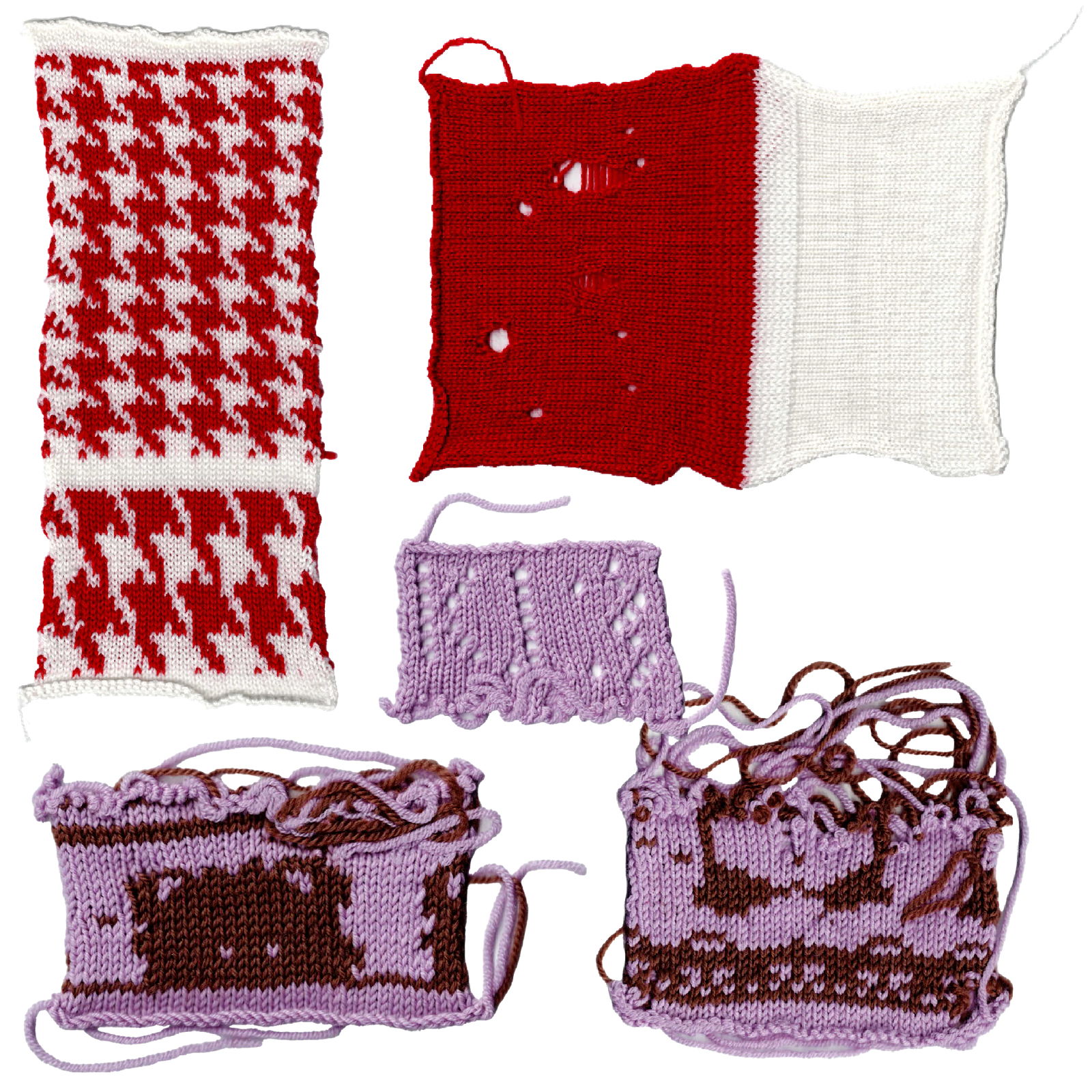
The knit machine induction was run by Angelica Kilkolly, a UTS fashion alumni who specialised in knit textiles for her design honours in 2021. Having dedicated significant time to such a niche skill, UTS invited her back as a knit machine technician and tutor. She believes the practice is worth preserving.
The induction covered the full process of operating the knit machine: setting up wool tension, casting on, knitting rows, switching colours, adjusting the size of a knit piece, and casting off. Angelica also taught techniques related to using and designing a custom punch card, and how to make deliberate holes in the knit to create negative space.
After falling in love with weaving during the Kullu Global Studio, I went looking for a loom on campus (which there wasn't) and found this instead. What surprised me was how similar the experience felt: the same tactile precision, the same mindful flow state, the same sense of working within a grid and its constraints. The punch card was easily the most interesting thing to me as it is essentially pixel art, reminding me of Susan Kare's pixel icon work for Apple that drew on traditional craft like cross-stitching (Letterform Archive, 2020). After the induction, I continued experimenting independently: making a negative space pixel art sample using the hole technique, and practicing knitting using punch cards. I plan to design a custom punch card to explore how the machine could translate pixel illustration and typography.
Letterform Archive. (2020, September 10). Notes on Icons and Design with Susan Kare [Lecture]. Youtube.
https://www.youtube.com/watch?v=4lx9Wtd2P48
✽ KNIT POSTER
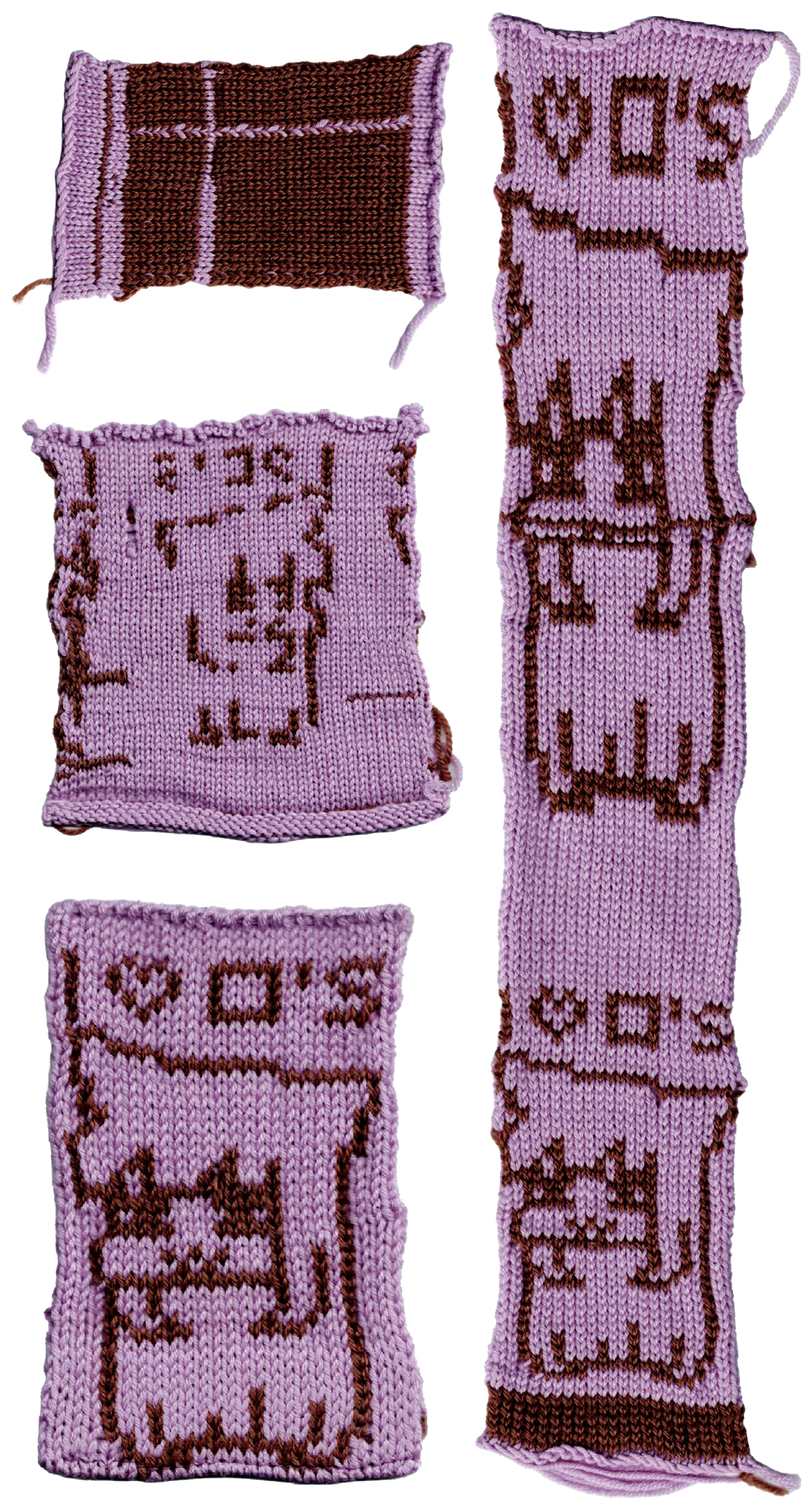

Intention:
To translate pixel illustrations and typography by making a poster with the knit machine.
Hypothesis:
Going to get so frustrated from the many failed attempts of trying to get the punch card to work and it’s probably going to unravel somewhere accidentally and I might explode. Nonetheless, I’m definitely going to enjoy it because it’s very technical and fidgety (which I love).
Context:
Just did the knit machine induction and it was so lit. The punch card immediately reminded me of pixel art, which felt like a natural connection to Susan Kare’s work. I wanted to experiment with it before potentially using the knit machine for a small publication.
Method:
- Design a poster with the 24x60 punch card grid with both typography and an illustration
- Translate design onto a punch card
- Knit the punch card design using the knit machine
Reflection:
The first few attempts were frustrating (a wrong punch card size, then a broken machine that couldn't read them properly), but once I got to a working machine, it was a success. Ironically, the broken machine produced an interesting unintentional grid pattern I want to revisit, possibly exploring it further for the "hack a process" brief. It makes me wonder if different punch card designs would generate different grids? Punching out the card was the least enjoyable part, though I got more efficient over time. Dude... instant flow state the second I started knitting, from beginning to end. I felt really connected with my physical hands, though my posture high-key hurt. Through iteration I resolved issues like flipped typography, thin borders, and an unwanted bottom strip. I want to refine further by bringing in thicker or gradient-dyed wool for more prominent "pixels" and play with colour. I'm also inspired to try a long-form scroll comic, make a scarf for a friend for this upcoming winter season ^_^ I’d like to revisit Angelica to learn how to finish a clean single motif. Overall really proud of the outcomes, and a reminder to myself to stretch before and after knitting.
                    _
                  _(_)_                          wWWWw   _                    _(_)_
      @@@@       (_)@(_)   vVVVv     _     @@@@  (___) _(_)_      @@@@       (_)@(_)   vVVVv     _
     @@()@@ wWWWw  (_)\    (___)   _(_)_  @@()@@   Y  (_)@(_)    @@()@@ wWWWw  (_)\    (___)   _(_)_
      @@@@  (___)     `|/    Y    (_)@(_)  @@@@   \|/   (_)\      @@@@  (___)     `|/    Y    (_)@(_)
       /      Y       \|    \|/    /(_)    \|      |/      |       /      Y       \|    \|/    /(_)
    \ |     \ |/       | / \ | /  \|/       |/    \|      \|/   \ |     \ |/       | / \ | /  \|/
    \\|//   \\|///  \\\|//\\\|/// \|///  \\\|//  \\|//  \\\|//  \\|//   \\|///  \\\|//\\\|/// \|///
^^^^^^^^^^^^^^^^^^^^^^^^^^^^^^^^^^^^^^^^^^^^^^^^^^^^^^^^^^^^^^^^^^^^^^^^^^^^^^^^^^^^^^^^^^^^^^^^^^^^^
GUESTBOOK
Thanks for your time. Feel free to leave a message! ♡( *ˊᗜˋ*)੭⁾⁾
Loading messages...